Building Blocks of Tour Guides
- Jun 21, 2024
- 2 min read
Updated: Jun 21, 2024
A tour guide is an important design material used by cities and companies to raise awareness for different attractions. When designing a tour guide, it is important to keep several building blocks in mind.
Tour Guide Layout
A tour guide is typically four pages, including a cover page. It includes captivating images, informative articles and contact information. Remember to adhere to the elements of design: typography, color, balance, unity, etc. When creating a design (especially one that is multiple pages) it is imperative to adhere to a color scheme, typography elements and brand identity. Here is more information on design elements and Adobe InDesign. Before starting on your tour guide, be sure to create a folder or Pinterest board with images, articles and websites that inspire your design. Another helpful tip is to outline the layout on paper before hand to get an idea of what you plan do in Adobe.
Tour Guide Design
As I started the project of designing a tour guide, I quickly realized that I would need to use both Adobe Photoshop and InDesign to achieve the desired look. I created the cover page in Photoshop. I decided that I wanted the title letters to stick out, so I used a thick font and added a pattern overlay in Layer Style. Here are some additional design tips.

I added a contrasting color behind the letters, as well as a drop shadow, to enhance the letters while adhering to the brand's image. I included an image from a travel photographer of the attraction in the tour guide. I also placed the brand logo at the bottom to further instate brand identity.
For the bulk of the tour guide, I used Adobe InDesign with the multiple page and layout guide features. I divided the pages and added designated places for text and images to create a cohesive design. To divide pages in InDesign, go to Layout then Create Guides.

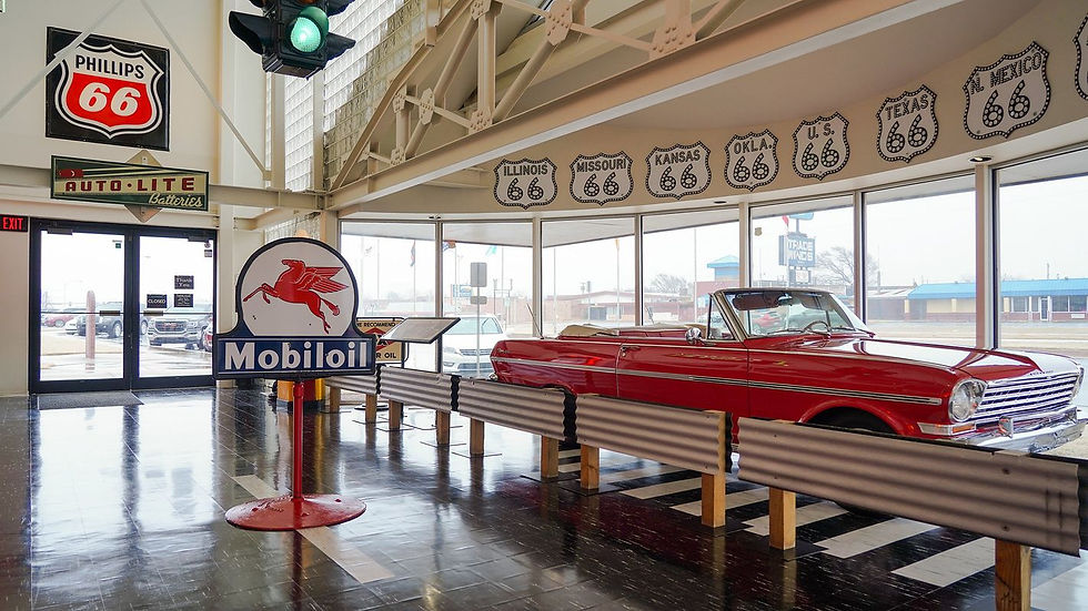
Regarding typography, it is important to separate aspects of an article using different font sizes, colors, boldness, etc. I used the font "impact" from the cover page for the article title and subtitles. I used the font "optima" for the body. I had previously used the font optima in a design for the Oklahoma Route 66 Centennial Commission. Re-using the font, along with the logo and colors may contribute to brand recognition. When using images, remember to give credit along with a short description.
The contact page could be considered to be the most important part of a tour guide. Remember to use bolded and large fonts to draw attention to it. A helpful aspect is adding lines to make the information stand out even more.


Comments